Branding

When we were first starting with homeschooling, I knew that I needed to get and keep earning Wanda’s buy-in. Doesn’t matter if a kid is at a traditional school or homeschool, refusal will eventually come. Wanda’s been into homeschool since the beginning (she begged me to start months earlier than I’d planned to), but I wanted to do whatever I could to set us up to ride out the rough times. It may sound kinda ridiculous, but I turned to the emotional imprinting of good ol’ branding.
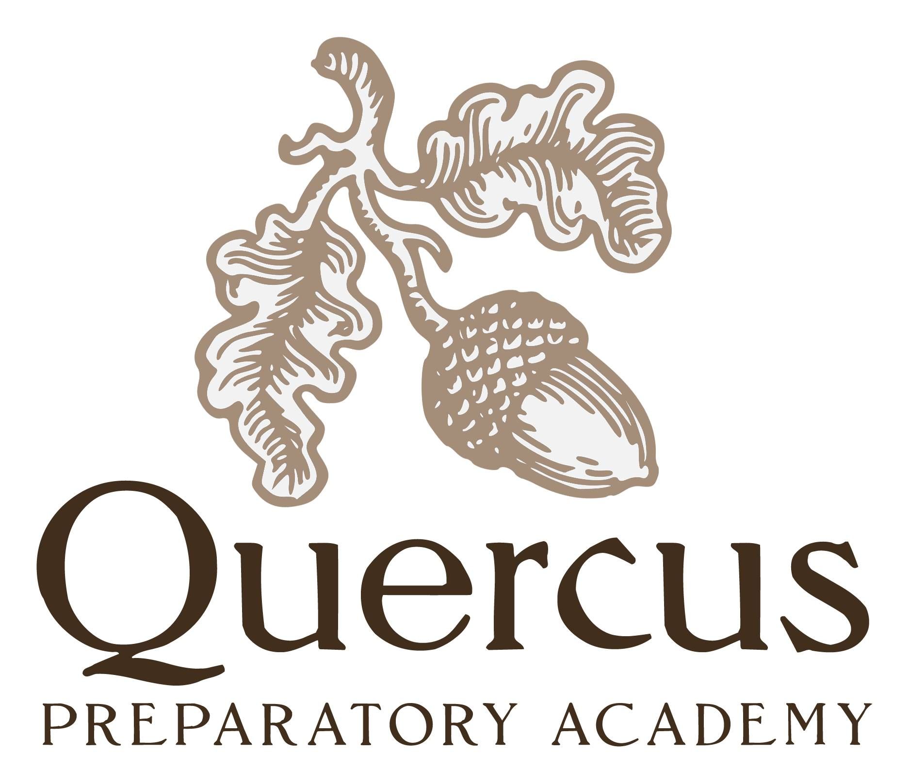
Our school name (one had to be chosen for our legal filing, anyway) is Quercus Preparatory Academy, or Quercus Prep for short. Quercus is the Latin genus name for oak trees, and it sounds a bit like quirky, which is perfect for our bright & quirky kid.
I want the school to feel legitimate to Wanda, I want her to have school pride. I want her to love learning here—absolutely the first priority there is to deliver a genuinely great learning experience, but emotionally connecting that with “Quercus Prep” has a compounding effect. We have a school logo, and we refer to “Quercus Prep” far more frequently than I would have guessed. Acorn Airlines (mentioned in my earlier post about our curriculum, linked below) is a nod to our school logo; Wanda came up with that name. The branding has worked on me, too, I love our quirky little school.
(The aesthetic I was aiming for when creating our logo was “early ‘90s small publishing house specializing in niche-interest technical books.”)